"introduction..." cover.... a critique?

All discussion related to Roger Keith (Syd) Barrett.
User avatar
henno
Moderator
Moderator
Posts: 3402
Joined: Fri May 07, 2004 12:58 pm
Location: .... set adrift on a memory bliss.....

"introduction..." cover.... a critique?

Post by henno »

Image

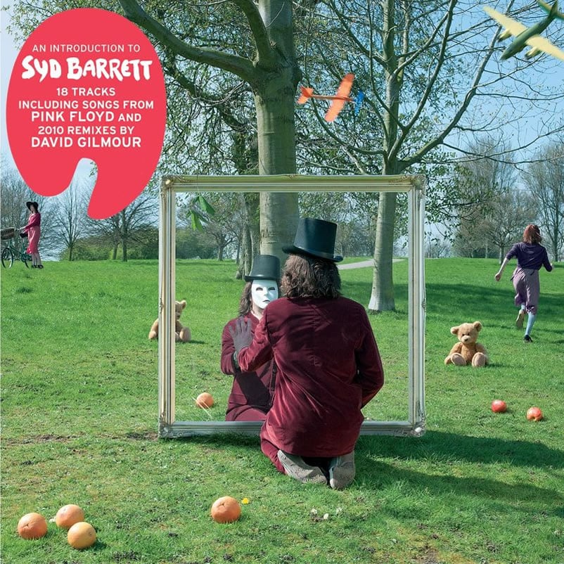
Personally i find this cover shot very, very disappointing. especially for a Storm Thorgerson piece of work.

The composition of the shot is messy, the two female characters being uninteresting in their location dissecting the horizon line. The central character is supposed to reflect a figure reflecting himself in a mirror, while at the same time we are supposed to be able to see through the mirror. the figure with the mask doesn't properly reflect the fore figure in that he/she is a lot smaller which throws off the perspective straight away.

The choice of location is banal at best. The lawn area is cut up in places, the sparseness of the tress and foliage do nothing to add to the photo. The two leaves, possibly sycamore, hanging forlorn in the top LHS of the mirror add to the sense of moroseness.

The effort incorporated into the picture seems lazy to me. a few apples and oranges strewn around the ground is pathetic. the other various elements seem disjointed and lifeless as well....

I do not think the cover captures any of syds playfulness at all.. .the first 6 songs on the listing evoke a wonderful world of syd images.... "a mouse called gerald"... "scribbly black and everything shines"... "Across the stream with wooden shoes
With bells to tell the king the news"..... "moonshine washing line".... etc.....
............and even his solo stuff has moment of pure genius...... "effervescing elephant with tiny eyes and great big smile"..... "with a honey plough of yellow prickly seeds, clover honey pots and mystic shining feed..."I'm only a person with Eskimo chain, I tattooed my brain all the way..."....

to me theres a myriad of opportunity within these lyrics to produce a completely fantastic image that evokes the best of storms work.... what about an elephant fizzing...... or a "scarlet eagle showering silver on the people"......

disappointing, lifeless, lazy ... i wonder does it actually reflect the release of the album.....

Discuss
User avatar
Hudini
Supreme Lord!
Supreme Lord!
Posts: 5787
Joined: Mon Apr 09, 2007 1:53 pm
Gender: Male
Location: Rattle That Lock... Baby!

Re: "introduction..." cover.... a critique?

Post by Hudini »

I'm glad that someone has proven me that I'm not crazy and that the cover may actually be bad... I didn't want to come up with this, but it seems that Henno has spotted a lot of faults I have too, so now I can put my two cents in.

First of all, the figure in the mirror doesn't look like a reflection at all, though it is obvious (no pun intended) that it represents one. It's much smaller than the figure in front of the mirror and it's not in the same position. Second, the shadow that "the mirror" casts on the ground is too full and it implies that it was either a full screen in front of which the figures was photographed or that it's a shadow of the person behind the screen, either way it looks like it wasn't taken much care of. Next, toy airplanes and teddy bears which obviously represent (mental) childhood are too cheap tricks and I won't even comment on scattered apples and oranges. I don't have a faintest idea of what the two female figures represent, and I somehow get the picture Storm Thorgerson doesn't either. What I do know is that they do more in ruining the composition that aiding it. One more thing, the main figure is wearing Converse All Stars! I mean, WTF?!

This cover looks more like a sketch than a finished work to me... And so do a lot of Storm's recent works, including "Echoes" and "Oh By The Way" which suffer from severe lack of imagination which was once his trademark. As far as I'm concerned, I sadly think that he should retire...
User avatar
jtull
Supreme Judge!
Supreme Judge!
Posts: 3354
Joined: Fri Feb 27, 2009 7:55 pm
Gender: Male

Re: "introduction..." cover.... a critique?

Post by jtull »

Hudini wrote: I don't have a faintest idea of what the two female figures represent..
Well, a girl on the left side of the picture(cover) represent song Bike, I guess..I've got a bike, you can ride it if you like, it's got a basket.. :)
User avatar
henno
Moderator
Moderator
Posts: 3402
Joined: Fri May 07, 2004 12:58 pm
Location: .... set adrift on a memory bliss.....

Re: "introduction..." cover.... a critique?

Post by henno »

the other is most probably "see emily play"... where syd has been reported as claiming he came up with the idea for the song after seeing a girl called emily running through a forest.....

yeah, ive no idea what the connection with the teddy bears and the airplanes are either...??? and im not that fussed to explore either as the reward isnt worth it... :(
User avatar
ddebil
Supreme Lord!
Supreme Lord!
Posts: 9075
Joined: Mon Jul 21, 2008 6:40 pm
Location: Truly gone ddebilfishing

Re: "introduction..." cover.... a critique?

Post by ddebil »

'Suspended animation, a state of bliss' -> Syd-> Learning To Fly -> Toy planes? Fucked if I know. :lol:
User avatar
zag
Judge!
Judge!
Posts: 2330
Joined: Wed Jun 25, 2003 11:50 pm
Location: in the woods

Re: "introduction..." cover.... a critique?

Post by zag »

The palette sticker looks ok, otherwise Storm´s cover art is just another cliché. Apples and Oranges. Bike. See Emily Play. I mean really ?

..."and brought me here instead dressed in red". :-s
User avatar
Damn!t
Supreme Lord!
Supreme Lord!
Posts: 8369
Joined: Thu Oct 28, 2004 9:55 pm
Location: travelling by telephone

Re: "introduction..." cover.... a critique?

Post by Damn!t »

This cover we saw looks a bit cropped. Final image will be a bit wider I think.
But, as you all stated , it's not really that good.
We are used to look at more greater images from Storms studio.
This was done in a hurry, and obviously he had to jam everything in that frame, so basically this cover cant breathe properly and doesent have that nice minimalism that most of his greater covers do.
Did he had specific directions from someone (Dave) or did he came up with this from his own head, I cant tell, but a bloke of his stature should not allow himself such subpar works.
User avatar
my breakfast.
Supreme Lord!
Supreme Lord!
Posts: 10918
Joined: Wed May 05, 2004 8:17 pm
Gender: Male
Location: Edinburgh - Scotland

Re: "introduction..." cover.... a critique?

Post by my breakfast. »

Typical Storm fare. Mysterious and the like. Dare I say it is a little bit paint-by-numbers?
User avatar
J Ed
Supreme Lord!
Supreme Lord!
Posts: 5133
Joined: Tue May 11, 2004 2:36 am
Location: in a midwestern-type autoplant town, waiting for the autopocalypse to come

Re: "introduction..." cover.... a critique?

Post by J Ed »

Hudini wrote:...the figure in the mirror doesn't look like a reflection at all, though it is obvious (no pun intended) that it represents one. It's much smaller than the figure in front of the mirror and it's not in the same position. ...
I dont think it is meant to represent a reflection, I think what we're seing is what we're supposed to see:
two mimes playacting as if one was a mirror reflection
if they were absolutely identical we wouldnt get that would we? there has to be some flaws to distinguish them

check this classic gag out:
http://www.youtube.com/watch?v=1kqT5DjCUNg
would that work better if the two Grouchos were more precisely in sync?
(actually one of thems Harpo though Im not sure which)
User avatar
Hudini
Supreme Lord!
Supreme Lord!
Posts: 5787
Joined: Mon Apr 09, 2007 1:53 pm
Gender: Male
Location: Rattle That Lock... Baby!

Re: "introduction..." cover.... a critique?

Post by Hudini »

J Ed wrote:two mimes playacting as if one was a mirror reflection
if they were absolutely identical we wouldnt get that would we? there has to be some flaws to distinguish them
Even it was so (and I don't count this option out), the person behind the mirror is still too small and it creates an illusion of being too far away in the perspective (intentionally or not) which looks like a banal PhotoShop mistake. By the length and the position of a normal grown up person's arm they should have been no more than a meter apart, but it appears as if they are much further apart than that. One thing just crossed my mind: maybe those models are designed to represent a grown up person and a child inside the false mirror? That would explain why one of the models is smaller than the other, but still the person inside the mirror isn't that much smaller to rule out any doubt about this theory.
User avatar
Idisaffect
Judge!
Judge!
Posts: 2039
Joined: Tue Sep 11, 2007 8:20 am
Gender: Male
Location: here now

Re: "introduction..." cover.... a critique?

Post by Idisaffect »

The cover definitely has a retro look. Are we sure it's not a leftover from the 70's? Storm and co. are capable of creating some real stinkers. Here's one from Hipgnosis from 1979. It's even more meaningless and dumb.
Image
User avatar
henno
Moderator
Moderator
Posts: 3402
Joined: Fri May 07, 2004 12:58 pm
Location: .... set adrift on a memory bliss.....

Re: "introduction..." cover.... a critique?

Post by henno »

J Ed wrote:I dont think it is meant to represent a reflection, I think what we're seing is what we're supposed to see:
two mimes playacting as if one was a mirror reflection
if they were absolutely identical we wouldnt get that would we? there has to be some flaws to distinguish them
i had though of that too... but there is not need to deliberately alter the size of the reflection because we can clearly see through the "mirror" and we clearly understand that it is not a reflection.... so why not, in my opinion, actually add to the illusion by having the reflection in the same proportion as the casting figure???

i suppose the theory that its a throw-away shot from an earlier time may be borne out in that there are no obvious references to syds solos stuff in the pic, is there??? apples and oranges, see emily play, bike?, matilda mother?,.....

oh, and yes idisaffect, thats a terrible album cover, laughable..!! :D
User avatar
henno
Moderator
Moderator
Posts: 3402
Joined: Fri May 07, 2004 12:58 pm
Location: .... set adrift on a memory bliss.....

Re: "introduction..." cover.... a critique?

Post by henno »

actually, thinking about it now, wouldnt it have been much better if the "mirror" was used as a type of doorway between worlds??? we may be able to see the banality of the real world in the extreme foreground and some of the side background, but what if we could see a world full of colour, fun and quirkiness through the "mirror"... as an homage to how syd may have seen the world, through childlike eyes??

perhaps in that situation, the mask should be on the casting figure and the real syd should be seen through the mirror??
User avatar
jtull
Supreme Judge!
Supreme Judge!
Posts: 3354
Joined: Fri Feb 27, 2009 7:55 pm
Gender: Male

Re: "introduction..." cover.... a critique?

Post by jtull »

The smaller person behind the mirror could be reference of the song "The Gnome" perhaps..? :-k
User avatar
Hudini
Supreme Lord!
Supreme Lord!
Posts: 5787
Joined: Mon Apr 09, 2007 1:53 pm
Gender: Male
Location: Rattle That Lock... Baby!

Re: "introduction..." cover.... a critique?

Post by Hudini »

henno wrote:actually, thinking about it now, wouldnt it have been much better if the "mirror" was used as a type of doorway between worlds??? we may be able to see the banality of the real world in the extreme foreground and some of the side background, but what if we could see a world full of colour, fun and quirkiness through the "mirror"...
Actually, that is an interesting idea, but unfortunately there is nothing in there that could tell us if the mirror really represents a mirror, a doorway between the worlds or simply an empty frame between two mimes. Unlike per instance this Dream Theater cover (by Larry Freemantle), which obviously makes its point speaking of mirrors:

Image

Or, there's another thin that crossed my mind: maybe the cover is designed simply to make people think and arise controversy? Maybe it's not a mirror, a doorway or an empty frame, and a mirror, a doorway and an empty frame all at the same time?

If that's so, then this work may actually be much better than it seems at the first glance...