Pink Floyd Album Covers
Pink Floyd album covers are some of the most recognised in the world because they are iconic and exceptionally memorable. Imagining Pink Floyd albums without their cover art is impossible because they form part of the art of the album. I would find it very hard to pick a favourite album cover out of the vast collection. Each of the album’s artwork displays, particularly when presented on a larger format LP, are simply stunning.
Who designed Pink Floyd Album Covers?
Pink Floyd is known not only for its progressive and psychedelic music. They are also known for their memorable and often surreal album covers. Many of these covers were designed by Storm Thorgerson and his design group, Hipgnosis. Storm was a difficult man to work with but a genius when it came to making memorable album covers.
Here’s a brief overview of some of the most notable Pink Floyd album covers.
Pink Floyd Album Cover Gallery
Here is the cover art to Pink Floyd’s studio albums. There is a detailed analysis of the album artwork below.


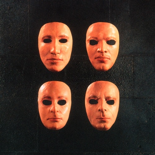

Some amazing images.
Additional Insights into Pink Floyds iconic Album Covers
These covers, much like the music of Pink Floyd, are designed to be thought-provoking, eliciting interpretations and emotions from the viewer. Many of the designs have become iconic in the world of music. They are instantly recognizable to fans and even casual listeners.
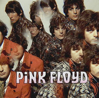
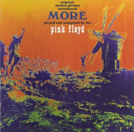
The Piper at the Gates of Dawn (1967):
“The Piper at the Gates of Dawn” is Pink Floyd’s debut album, released in 1967. It’s the only full album that was made under the leadership of Syd Barrett. Syd was one of the founding members of Pink Floyd. He was also a key figure in the early days of the band.
Album Cover Description:
The cover for “The Piper at the Gates of Dawn” features a photograph of the band members taken by Vic Singh. Using a prism lens given to him by George Harrison from The Beatles, Singh captured the band in a unique, kaleidoscopic shot. The photo exudes a psychedelic aura. The prism lens effect producing multiple distorted images of each band member. This was quite fitting given the psychedelic nature of the music within the album. The lighting and the slightly unfocused effect give it a dreamlike quality. This aligns with the themes of many songs on the album.
This portrait is emblematic of the 1960s counterculture and psychedelic movement, both in its visual technique and the look of the band members. The design is relatively simple, especially when compared to later Pink Floyd album covers. However, it captures the essence of the era and the early sound of the band.
For many fans, the cover also holds a poignant reminder of Syd Barrett. Syd would soon depart from the band due to deteriorating mental health, exacerbated by heavy drug use. His creative genius was a driving force behind “The Piper at the Gates of Dawn”. This made the album a unique piece in the Pink Floyd discography.
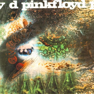
A Saucerful of Secrets (1968):
This cover has a kaleidoscopic and multi-layered design, combining various images that convey an otherworldly, psychedelic feel.
“A Saucerful of Secrets” is Pink Floyd’s second studio album, released in 1968. It is significant as the only studio album that features all five main members of the band: Syd Barrett, Roger Waters, Richard Wright, Nick Mason, and David Gilmour. Barrett’s diminishing role in the band and Gilmour’s recent addition means they both played on the album, but Barrett’s influence was fading due to his deteriorating mental health.
Album Cover Description:
The cover of “A Saucerful of Secrets” is visually complex. It reflects the transitional and experimental nature of the music it houses.
Designed by Hipgnosis, the renowned art design group co-founded by Storm Thorgerson and Aubrey Powell, the cover is a collage of images. These images are diverse and intriguing:
- A series of pictures of the band themselves, tinted in a purple hue.
- Dr. Strange from the Marvel universe, taken from a comic book panel. This inclusion might hint at the surreal and otherworldly themes of the album.
- A photograph of a girl diving, creating a splash but no ripples on the water surface. This gives it a frozen-in-time appearance.
- An image of the planets Saturn and Mars.
The overall feel of the cover is otherworldly and mysterious, hinting at the boundaries the band was pushing both in terms of music and their personal dynamics at the time. The cover, like the album’s content, offers a blend of the ethereal and the grounded, the known and the mysterious. It’s a visual representation of a band in flux, caught between the psychedelic whimsy of their past and the more structured, thematic rock they would produce in the future.
Ummagumma (1969):
“Ummagumma” is a double album by Pink Floyd, released in 1969. It’s unique in the band’s discography because one record features live tracks recorded during their 1969 concerts, while the other contains solo compositions by each of the four band members.
Album Cover Description:
The cover of “Ummagumma” is one of Pink Floyd’s more conceptual and intriguing designs, created by Hipgnosis, which was the art design group frequently associated with the band’s album art.
The front cover displays a recursive image (an image within an image) of the band. Starting with a picture of the band members in the foreground, behind them is a larger image of the band with the same background scene, and this repetition continues, creating a ‘picture-within-a-picture’ effect. This recursive theme might be interpreted as a reflection of the album’s duality with its live and studio sides, or perhaps the introspective nature of the solo compositions.
In the background, you can see some of their equipment and a few other items, including the iconic Azimuth Co-ordinator, which was one of the first quadraphonic sound systems and was used by Richard Wright during live performances.
The back cover features another intriguing image: a shot of the band’s equipment set up in a field. This contrasts with the front by focusing on the tools of their trade rather than the members themselves.
As a note of trivia, the album’s name, “Ummagumma”, is Cambridge slang for sexual intercourse. Given Pink Floyd’s penchant for the offbeat, it’s not too surprising they’d choose such an unconventional name for their album.
The whole design, with its slightly surreal and introspective feel, complements the experimental nature of the music contained within “Ummagumma”.
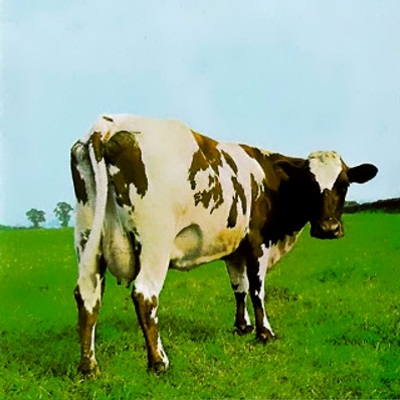
Atom Heart Mother (1970):
“Atom Heart Mother,” released in 1970, represents one of Pink Floyd’s more experimental albums, featuring a side-long title track that combines rock, choir, and orchestra.
Album Cover Description:
The cover of “Atom Heart Mother” is both iconic and a departure from the psychedelic imagery commonly associated with Pink Floyd during the late 1960s. Designed by Hipgnosis, the cover features a single cow standing in a pasture. The cow’s name is Lulubelle III. What’s particularly notable is the absence of any text or band name on the front cover, which makes the image even more enigmatic.
The simplicity of the image was quite different from the intricate and symbolic designs often found in rock albums of the time. This could be seen as a deliberate contrast to the complexity of the title track on the album. Storm Thorgerson of Hipgnosis mentioned in interviews that the idea was to create something as mundane and everyday as possible, to contrast against the psychedelic and experimental nature of the music. The band, looking for something different, agreed to the idea.
The back cover continues the agricultural theme, presenting a collection of pictures, including more cows and other pastoral scenes.
The “Atom Heart Mother” cover is a testament to Pink Floyd’s and Hipgnosis’ willingness to defy expectations and take risks, even in album artwork. It stands out in the Pink Floyd catalog as one of their more mysterious and understated covers, prompting listeners to wonder about the connection between the serene, bucolic image of a cow and the deep, experimental tracks within.
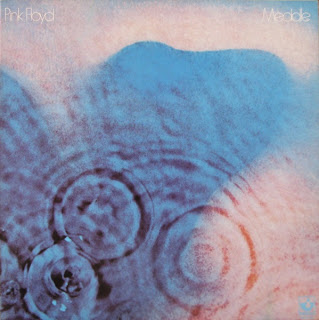
Meddle (1971):
“Meddle,” released in 1971, is often regarded as a transitional album for Pink Floyd, bridging their earlier psychedelic work with the more structured and thematic albums that would follow. The music on “Meddle” showcases the band’s evolving sound, including one of their most beloved compositions, “Echoes.”
Album Cover Description:
The cover of “Meddle” is both subtle and evocative. It features a close-up image of an ear, underlaid with ripples, as if it’s underwater, and the ear itself is tinted in a blueish hue. The ripples give the impression of sound waves emanating from or into the ear, symbolizing listening or sound propagation.
Designed once again by Hipgnosis, the artwork conceptually plays with the idea of sound and how it interacts with the human sense of hearing. The ripple effect, combined with the blue tint, gives the cover a somewhat surreal or dreamlike quality, which aligns with the ambient and experimental nature of some of the tracks on the album.
Originally, the design concept by Storm Thorgerson was much different. He wanted to photograph an ear underwater, lit by the sun to create a ripple effect. However, the final result was achieved using dye and other techniques to get the desired effect on the image.
The title “Meddle” is derived from the band’s constant meddling with the album’s tracks during the recording process. The word itself is embossed in relief on the original LP covers but is not colored, making it a subtle element against the textured image of the ear.
Overall, the “Meddle” album cover is a visual representation of sound and listening, and like many Pink Floyd albums, it pairs a conceptual image with the thematic elements of the music inside.
The Dark Side of the Moon (1973):
One of the most iconic album covers in rock history, it shows a prism refracting a beam of light into its constituent colours. The design is a perfect allegory for the album’s themes of life, death, madness, and time.
“The Dark Side of the Moon,” released in 1973, is undeniably one of Pink Floyd’s most iconic albums, and its cover is among the most recognizable in the history of rock music.
Album Cover Description:
The album cover is a simple yet highly symbolic design. It features a beam of white light entering a prism and refracting into its constituent colors, spreading out in a rainbow spectrum. This image is set against a stark black background.
Here’s a breakdown of its elements and possible interpretations:
- Prism and Light: The prism splitting light into various colors can represent the multifaceted nature of life and human experience. It can also be seen as a visual representation of the album’s exploration of varied themes, from the passage of time to the pressures of fame, mental illness, and death.
- Simplicity: The design is notably minimalist, especially when compared to Pink Floyd’s previous albums. This simplicity makes it striking and memorable.
- Black Background: The expansive black backdrop can be symbolic of the unknown, the infinite, or the vastness of space. It provides a stark contrast to the vibrant spectrum, making the colors stand out.
- Connection to Music: The dispersion of light can also be seen as analogous to sound frequencies, with the album itself being a spectrum of musical exploration.
The cover was designed by Storm Thorgerson of Hipgnosis, who was responsible for many of Pink Floyd’s album covers. The band wanted something simple, bold, and striking, and Thorgerson’s design perfectly encapsulated that vision.
The album’s themes revolve around the various pressures and challenges of life that can lead someone to insanity, which is hinted at by the title “The Dark Side of the Moon.” While the cover doesn’t directly depict these themes, its abstract representation allows for multiple interpretations, making it a perfect complement to the music.
To this day, the cover remains not only a symbol for the album itself but also an emblem of rock music and the era from which it emerged.
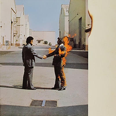
Wish You Were Here (1975):
“Wish You Were Here,” released in 1975, is one of Pink Floyd’s most emotionally resonant albums, addressing themes of absence, the music industry’s machinations, and the deteriorating mental health of former band member Syd Barrett.
Album Cover Description:
The cover of “Wish You Were Here” is a photograph of two businessmen shaking hands, with one of them engulfed in flames. This striking and surreal image is set against the backdrop of a movie studio lot, and it’s one of the more memorable covers in rock history.
The themes and interpretations associated with the cover include:
- The Handshake: The act of two businessmen shaking hands is typically seen as a gesture of agreement or partnership, but the fire introduces an element of danger, betrayal, or unexpected consequence. It’s a stark commentary on the hollow nature of many business interactions, especially in the music industry.
- Burning Man: The man on fire remains calm, continuing the handshake despite being engulfed in flames. This can represent the idea of people going through the motions or maintaining a facade even when things are falling apart.
- Absence: The title “Wish You Were Here” evokes a feeling of absence and longing. While the cover doesn’t depict absence directly, the burning figure and the sterile environment of the studio lot hint at a lack of genuine human connection.
- Back Cover and Inner Sleeve: The album’s artwork doesn’t stop at the front cover. The back cover features a faceless salesman, which ties into the themes of alienation and the music industry’s impersonal nature. The inner sleeve presents a diving man in a ripple-free water environment and a veil-clad woman in a windswept desert, adding more layers of symbolism and interpretation.
The cover, like the album’s music, was a collaboration between Pink Floyd and the design team Hipgnosis, with Storm Thorgerson and Aubrey Powell leading the creative charge. The actual photograph of the burning man was perilous to capture, and stuntman Ronnie Rondell, who was set on fire, performed it.
“Wish You Were Here” is an exploration of the band’s feelings about themselves, their fame, and the industry that shaped them. The cover perfectly captures the album’s sentiment, offering a visual critique that complements the musical content.
Animals (1977):
“Animals,” released in 1977, is one of Pink Floyd’s more politically charged albums. It takes inspiration from George Orwell’s “Animal Farm,” with its songs classifying humans as different types of animals (dogs, pigs, and sheep) to critique the socio-political environment of the time, particularly in the UK.
Album Cover Description:
The cover of “Animals” is an iconic photograph of Battersea Power Station in London with a giant inflatable pig floating between its chimneys. The stark industrial imagery, combined with the surreal sight of the pig, creates a visually arresting juxtaposition.
Here’s a deeper dive into the cover elements:
- Battersea Power Station: This decommissioned coal-fired power station is one of London’s most recognizable landmarks. Its imposing industrial structure serves as a symbol of the cold, mechanical, and impersonal nature of urban life and industrial society.
- The Inflatable Pig: Named “Algie,” the pig contrasts sharply with the industrial setting. In the context of the album’s themes, the pig represents the greed and corruption of those in power. The idea of a pig floating aimlessly also provides a sense of something being out of place or a system that’s gone awry.
- Photography Challenges: The original plan for the album cover involved the inflatable pig floating between the chimneys with no additional effects. However, during the photoshoot, the pig broke free from its moorings and rose into the flight path of Heathrow Airport. It later landed in a rural area. As a result, the cover image had to be created by combining a photo of the power station with another shot of the pig.
- Spine Message: On the spine of the original vinyl release, a small text message reads: “Gilmour, Mason, Waters, Wright” – referring to the band members. This was unusual for Pink Floyd albums, which typically didn’t feature the band members’ names on the front or back covers.
The cover was, once again, a product of the collaboration between Pink Floyd and the design team Hipgnosis.
The themes of “Animals” are dark, highlighting societal decay, the ruthlessness of capitalism, and the dehumanizing aspects of modern life. The album cover’s imagery, with the massive power station and the out-of-place pig, complements these themes perfectly.
The Wall (1979):
“The Wall,” released in 1979, stands as one of Pink Floyd’s most ambitious projects. The album is a rock opera that tells the story of Pink, a rock star who, due to the traumas and pressures of life, constructs a metaphorical wall around himself, leading to his isolation and eventual self-destruction. The narrative was heavily influenced by Roger Waters’ own life experiences.
Album Cover Description:
The cover of “The Wall” is stark in its simplicity, yet it’s highly effective in conveying the album’s themes.
The front cover features nothing but a plain white brick wall. There are no words, no title, no band name—just the unbroken expanse of white bricks. This minimalist design is symbolic of the isolation and emptiness central to the album’s narrative.
Key points about the cover:
- Minimalism: The simplicity of the cover stands out, especially in comparison to the rich and detailed imagery of previous Pink Floyd albums. This minimalism directly relates to the concept of the album, representing isolation, barriers, and emotional walls.
- Inside and Other Artwork: While the external cover is minimalist, the inner sleeves and gatefold of the original vinyl release feature the detailed and often grotesque illustrations of Gerald Scarfe. Scarfe’s artwork is integral to “The Wall,” not only appearing in album art but also in the subsequent film adaptation and stage shows. His illustrations give life to the characters and themes of the story, such as the monstrous “Mother,” the authoritarian schoolteacher, and the marching hammers – symbols of oppressive conformity.
- The Wall Motif: Throughout the album, live shows, and film, the wall motif is recurrent. It’s built brick by brick as Pink faces various traumas and challenges. The unadorned wall on the album cover symbolizes the culmination of this process, with Pink completely walled off from the world.
- Title and Typography: The spines of the original vinyl release bear the album’s title and a distinctive jagged font, which became associated with the project. This typography is consistent with Scarfe’s graphic style.
The cover for “The Wall,” in its starkness, perfectly encapsulates the album’s exploration of isolation, trauma, and the walls people build around themselves. As with many of Pink Floyd’s albums, the cover art is an essential aspect of the overall narrative and experience of the work.
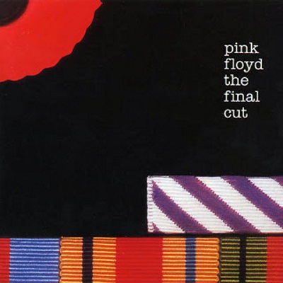
The Final Cut (1983):
“The Final Cut,” released in 1983, is Pink Floyd’s twelfth studio album. Often described as more of a Roger Waters solo project, the album delves deep into the themes of war, loss, and societal decay. These themes are rooted in Waters’ personal feelings about his father’s death in World War II, as well as his disdain for contemporary politics, especially regarding the Falklands War.
Album Cover Description:
The cover for “The Final Cut” is much in line with its somber themes:
- Main Imagery: The primary image on the front cover is of a collection of war medals, symbolizing honor, sacrifice, and the costs of war. One of the medals, instead of a traditional ribbon, has a striped piece of fabric that resembles the album’s spine design. This connects the personal sacrifices symbolized by the medals to the broader themes of the album.
- Background: The medals are set against a black background, which adds to the album’s somber and mournful tone.
- Title and Subtitle: The album’s title, “The Final Cut,” is displayed prominently. Below the title, the album also bears the subtitle “A Requiem for the Post War Dream,” which reinforces the themes of loss, mourning, and Waters’ disillusionment with the promises made by society after World War II.
- Spine Design: The spine of the album, both in its vinyl and later CD versions, features a distinctive stripe pattern, which, as mentioned earlier, also appears on one of the war medals on the front cover.
The artwork for “The Final Cut” lacks the more surreal or abstract imagery of some of Pink Floyd’s other albums, opting instead for a direct and somber reflection of its themes. The focus on war medals is a poignant reminder of both the personal and collective costs of conflict.
As with many Pink Floyd albums, the cover art is not just a visual accessory but an integral part of the narrative and thematic tapestry of the work. In the case of “The Final Cut,” the artwork underscores the deep sense of loss and the questioning of societal values that permeate the album.
A Momentary Lapse of Reason (1987):
“A Momentary Lapse of Reason,” released in 1987, marked a significant turning point for Pink Floyd. It was the first studio album after Roger Waters’ departure, and there was considerable tension surrounding its creation and release. With David Gilmour leading the way, the album shifted towards a more modern and atmospheric sound compared to the band’s previous works.
Album Cover Description:
The cover for “A Momentary Lapse of Reason” is visually captivating and continues Pink Floyd’s tradition of using distinctive and symbolic artwork.
- Main Imagery: The cover displays hundreds of beds placed on the beach and shoreline stretching out into the distance, with calm waters on one side and imposing cliffs on the other. The sky is tinged with pink and blue hues, indicating either dawn or dusk.
- Symbolism: The vast array of beds in an unexpected setting like a beach can be interpreted in many ways. Beds often represent rest, dreams, or the subconscious mind. The juxtaposition of these beds in an open, natural setting might symbolize the contrast between the personal and intimate against the vastness of the external world. Given the album’s title, it can also reflect themes of dreams, reality, and fleeting moments of clarity or confusion.
- Creation: The scene was not just a product of photo manipulation but was created practically. Under the direction of the design group Storm Studios, led by Storm Thorgerson (formerly of Hipgnosis), around 800 hospital beds were set up at Saunton Sands in Devon for the photoshoot.
- Back Cover: The back cover of the album features a close-up shot of one of the beds with a winged mirror, adding to the surreal imagery. The mirror reflects the sky, emphasizing themes of reflection, perception, and duality.
- Title and Typography: The album’s title, “A Momentary Lapse of Reason,” is placed at the top in white font, contrasting the darker background. The title itself, combined with the surreal image, hints at moments of irrationality, dreams, or altered perceptions.
“A Momentary Lapse of Reason” has an album cover that, while distinct from the more politically charged covers from the Waters-led era, retains the dreamlike and surreal quality that Pink Floyd album covers are known for. It evokes a sense of introspection, wonder, and the blurring lines between reality and dreams.
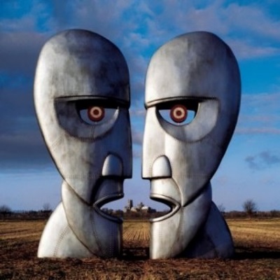
The Division Bell (1994):
“The Division Bell,” released in 1994, is the fourteenth studio album by Pink Floyd. The album’s themes revolve around communication, the passage of time, and the decisions people make throughout their lives. It was also the last studio album to be released by the band before Richard Wright’s death in 2008 and the final Pink Floyd album until “The Endless River” in 2014.
Album Cover Description:
The artwork for “The Division Bell” is both enigmatic and deeply symbolic, reflecting the album’s contemplative themes.
- Main Imagery: The front cover features two large metal statues facing each other, with their profiles together forming the illusion of a third, larger face in the negative space between them. These statues are located in a grassy field, and the sky above is tinged with blue and pink hues.
- Statues’ Symbolism: The statues, designed by Keith Breeden and crafted by John Robertson, represent the act of communication, dialogue, and the duality of human nature. The third face formed by the negative space can be interpreted as the collective result or the “third entity” that arises from communication or a relationship between two individuals.
- Title and Bells: The album’s title, “The Division Bell,” refers to the bell rung in the British Parliament to announce a vote. This ties back to the themes of decision-making and the consequences that arise from those decisions. Bells also feature prominently in the album’s sonic landscape, especially in the opening track “Cluster One.”
- Back Cover and Inner Art: The back cover displays the two statues from a different angle, focusing on the third face. The album’s inner artwork also includes various images of the statues in different settings and lighting, further exploring the themes of perception, reflection, and communication.
- Pulse Light: An interesting easter egg for fans was the blinking red light on the spine of the CD case for the first pressings of the album. This light, powered by a battery, would “pulse” continuously and was a nod to the album’s themes of communication and the passage of time.
The cover, like many of Pink Floyd’s albums, was produced in collaboration with Storm Thorgerson, a longtime collaborator and member of the design firm Hipgnosis.
“The Division Bell” cover art, with its surreal and thought-provoking imagery, perfectly complements the album’s introspective and atmospheric music. It invites the viewer to contemplate communication, the decisions we make, and the resulting echoes in the corridors of time.
The Endless River (2014):

“The Endless River,” released in 2014, is Pink Floyd’s fifteenth and final studio album. Primarily instrumental, the album serves as a tribute to Richard Wright, the band’s keyboardist who passed away in 2008. It features music that was initially recorded during the “The Division Bell” sessions in the 1990s and was later revisited and completed by David Gilmour and Nick Mason.
Album Cover Description:
The artwork for “The Endless River” departs from the style of previous Pink Floyd albums but remains visually striking and symbolic.
- Main Imagery: The cover displays a man on a small wooden boat, punting on a “river” of clouds that stretches out towards the horizon. Above, the vast expanse of the sky is filled with more clouds, and below, a mirror-like surface reflects the scene. The entire image gives a serene and dreamlike impression.
- Symbolism: The cover can be seen as a journey through the “river of life” or perhaps an exploration of the ethereal nature of existence. Given the album’s tribute to Richard Wright, it can also be interpreted as a journey through memories or a passage to the afterlife. The serene and reflective atmosphere aligns with the album’s mostly instrumental and ambient nature.
- Creation: The cover was designed by 18-year-old Egyptian digital artist Ahmed Emad Eldin. The band’s creative director, Aubrey Powell (co-founder of Hipgnosis), discovered Eldin’s work online and felt it perfectly captured the essence of the album. This choice marked a departure from the long-standing collaboration between Pink Floyd and Storm Thorgerson, who passed away in 2013.
- Title Placement: The title “The Endless River” and the band’s name are placed at the bottom of the cover in a subdued font, not detracting from the main artwork.
The cover of “The Endless River,” with its tranquil and ethereal imagery, serves as a fitting visual representation for the album’s meditative and nostalgic music. The album and its artwork act as a contemplative farewell, not just to Richard Wright, but also to the band’s long and iconic journey in the world of music.
Links
Read about Pink Floyd albums and their lyrics
Enjoyed the visuals? Delve more into the photos of Pink Floyd
Visit the Official Pink Floyd website